This is a compilation of several visual identity projects.
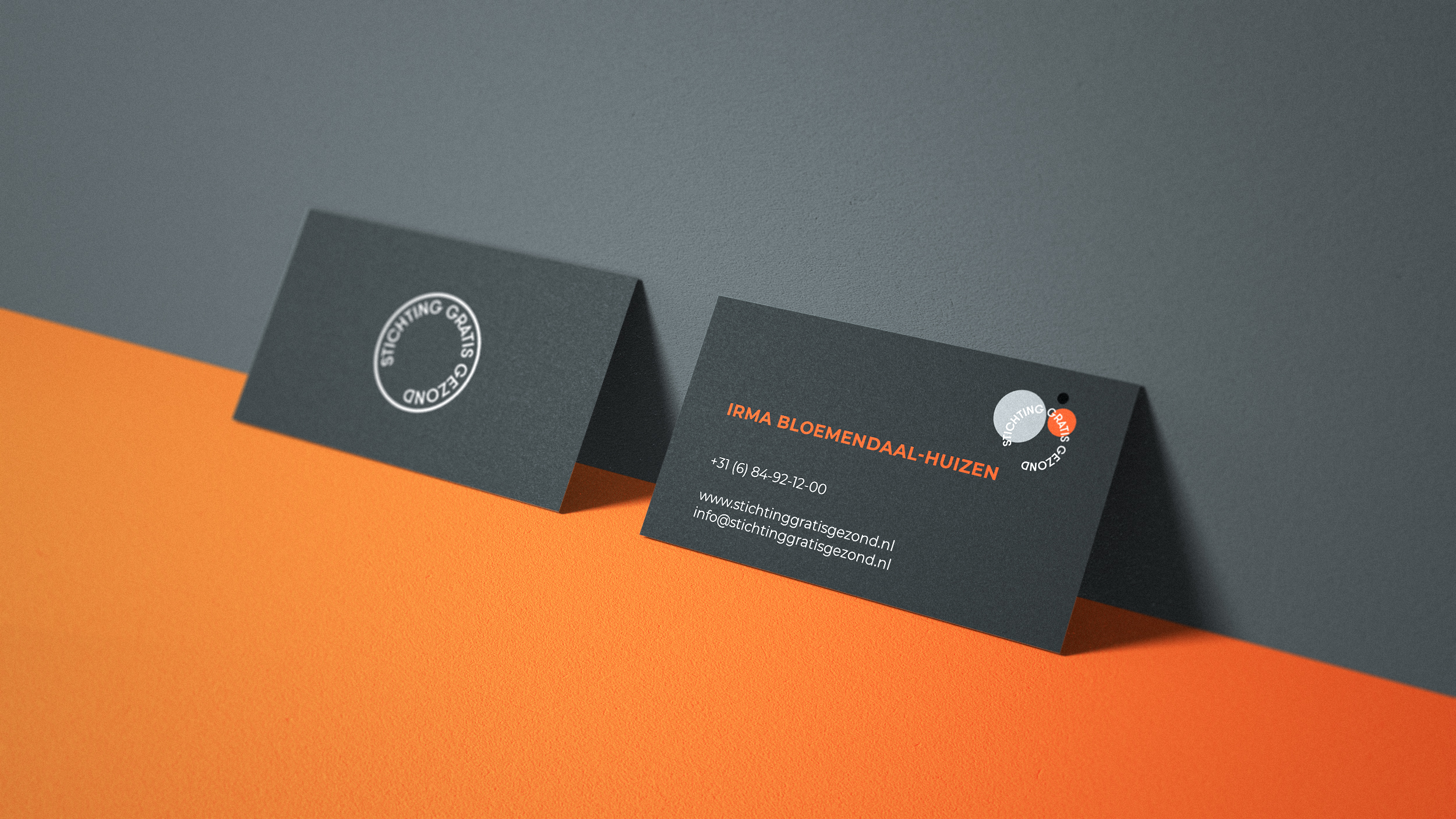
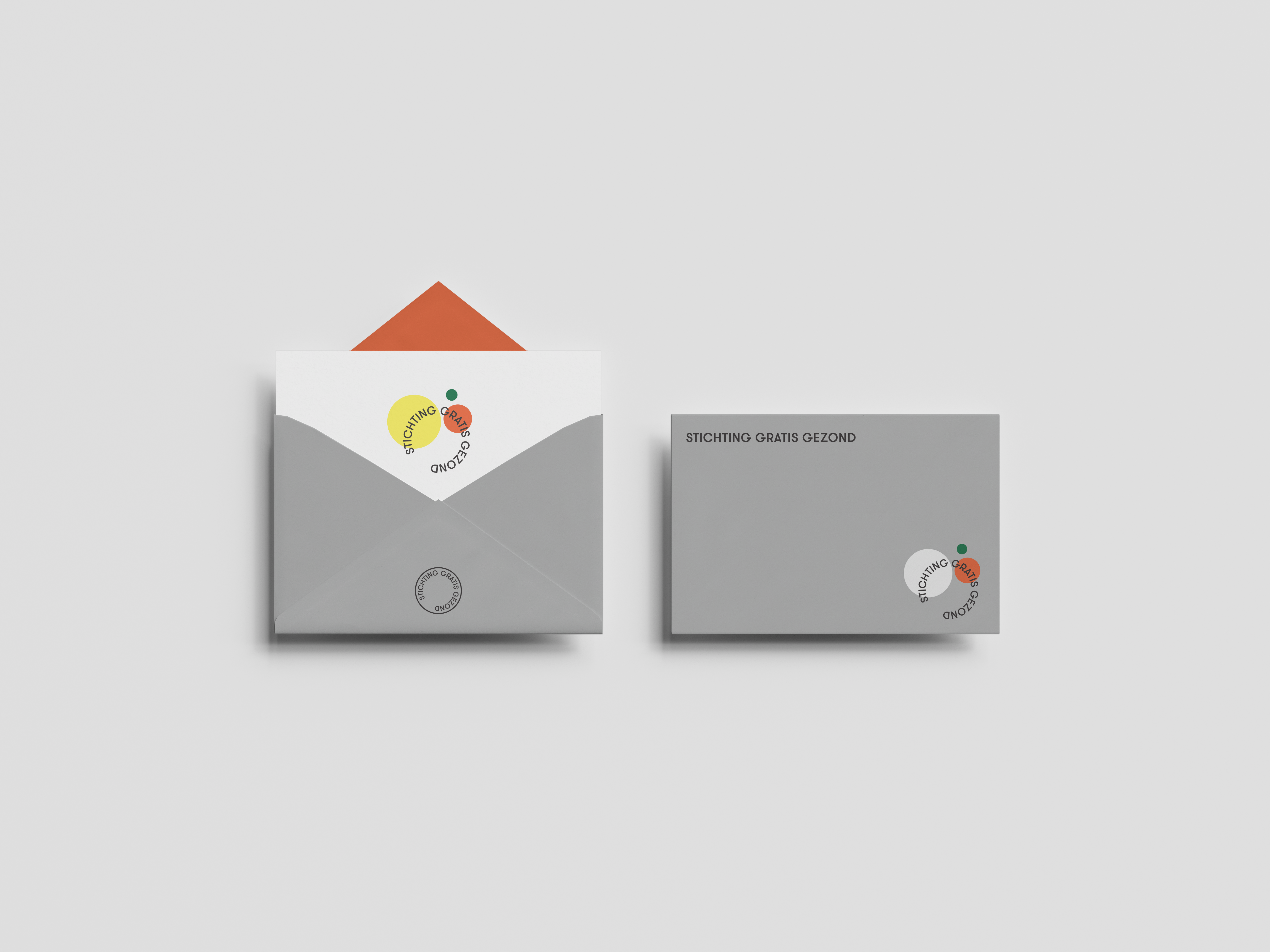
Project: Logo and stationary for Stichting Gratis Gezond (Free Health Fund).
Goal: To make a bright yet respectable identity for a charity organisation that helps people who cannot afford a life style coach to lose weight. The identity should envoke positive emotions as well as a trustworthy look and feel.
Solution: A logo made with a stable geometric san-serif has a circular movement that reminds of personal seal as a guarantee of trustworthiness. Bright colours combine with calmer greys to achieve the balance between a joyful, hopeful mood and security neccesery for an organisation dealing with signinficant financial donations.
February 2020.

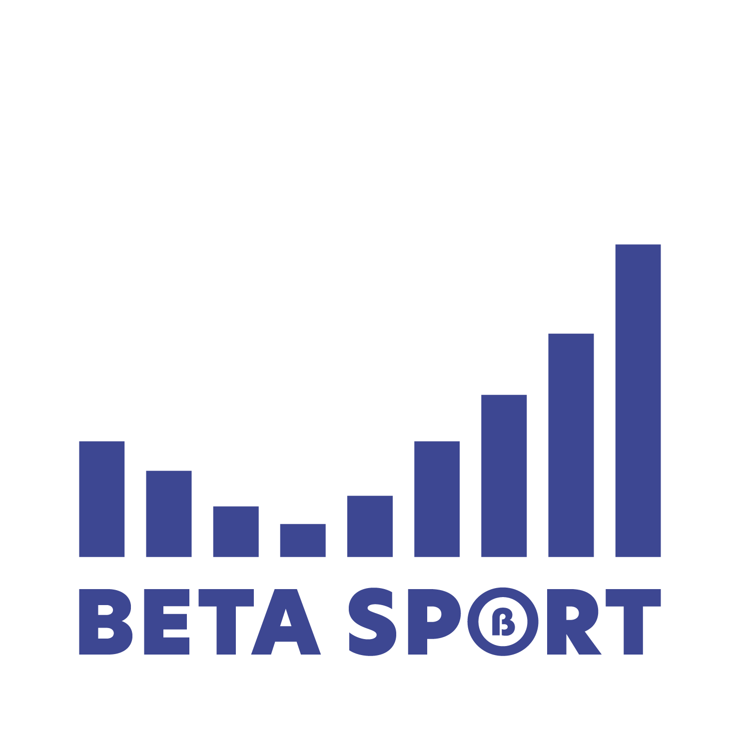
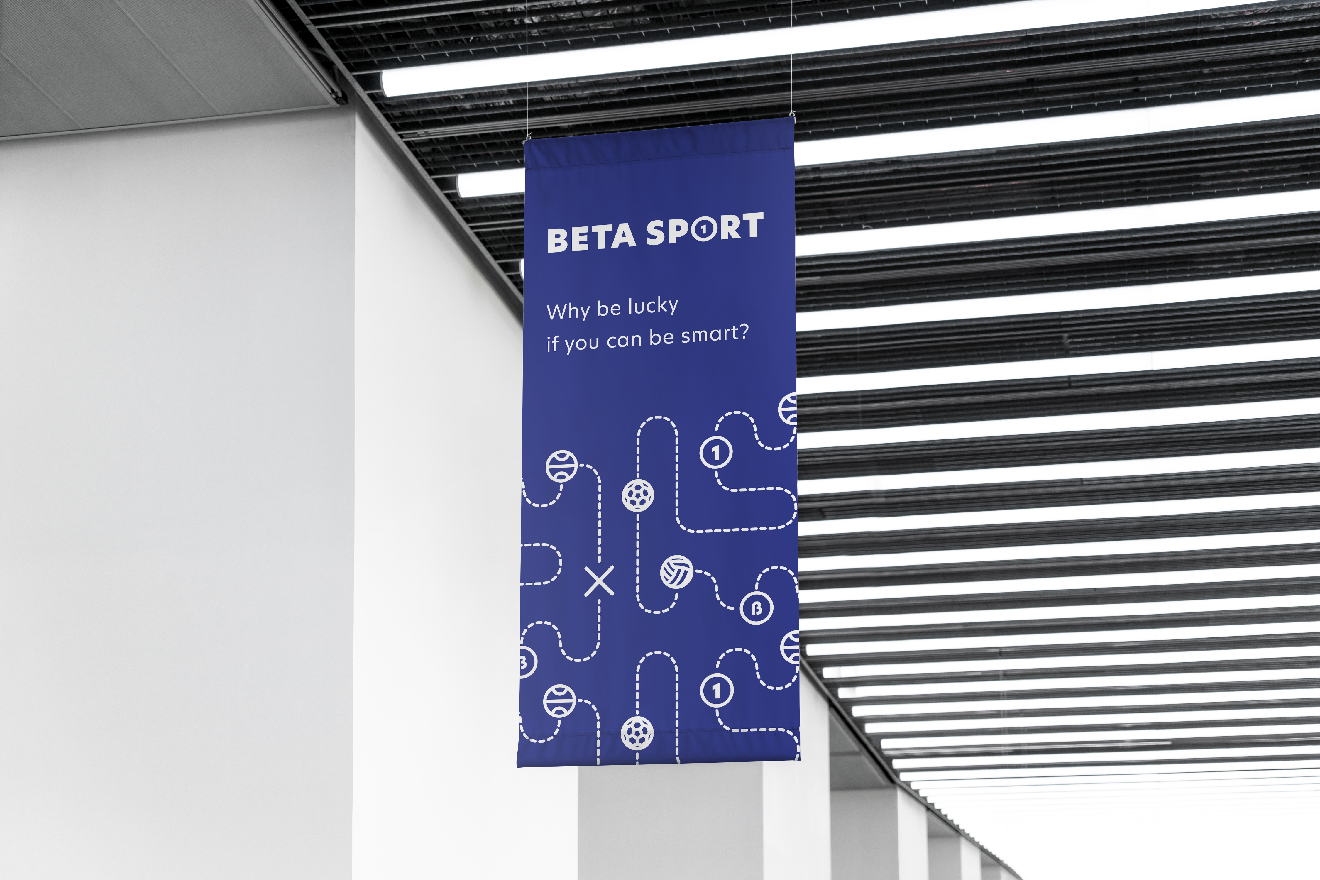
Project: Logo for online betting analytics company BetaSport.
Goal: To create visuals representing mathematical, analytical approach to sports for a reasonably well-to-do male audience of 35+. The logo should work in various scales and environments starting from a Telegram channel avatar to website and printed media.
Solution: A set of visuals based around sport related tokens and analytical charts. Stable and reassuring compositions of the logo have several variations to expand and schrink designs according to the needs. The simple and traditional colour scheme is easy to operate for every content creating employer.
October 2019.





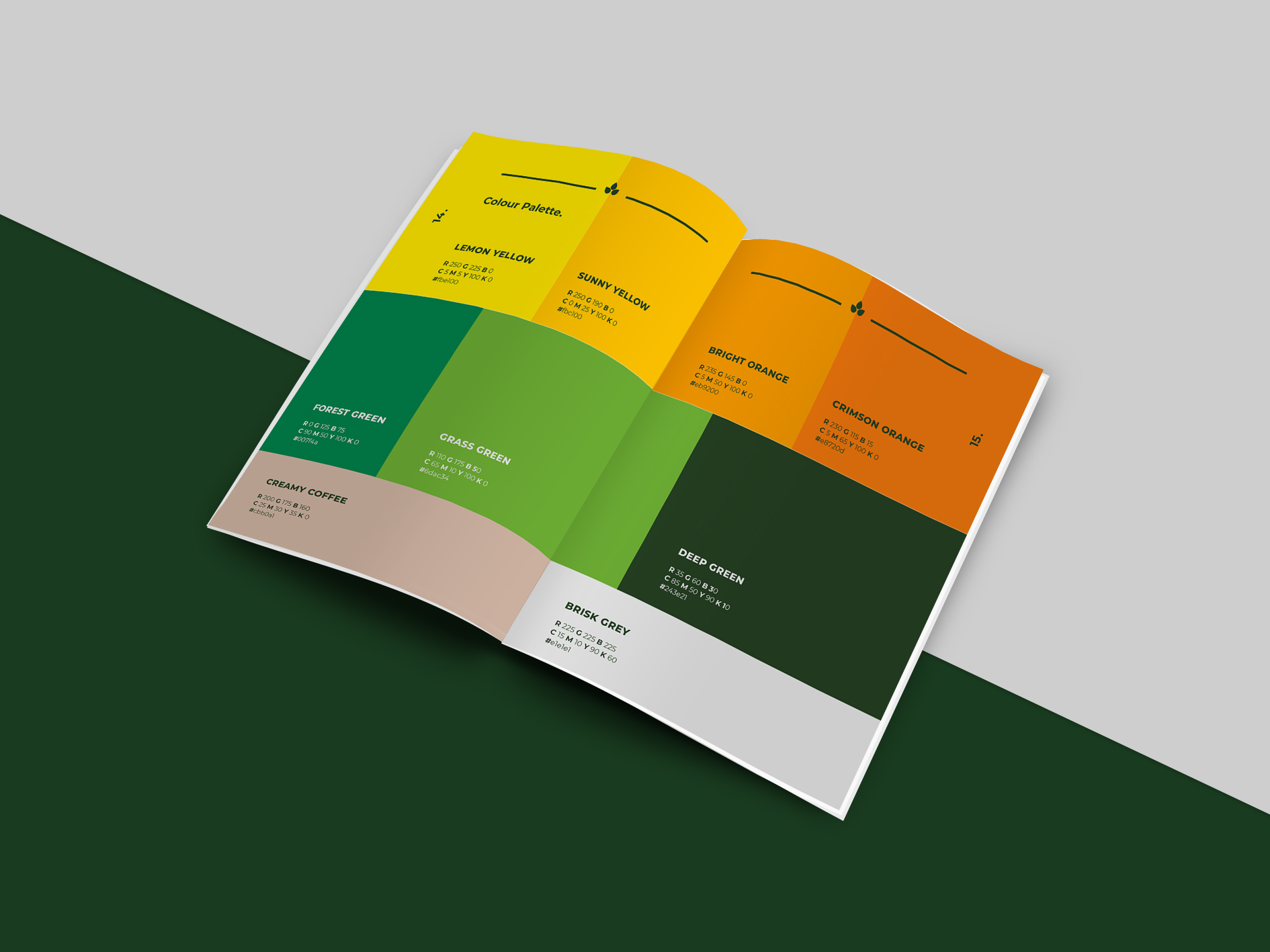
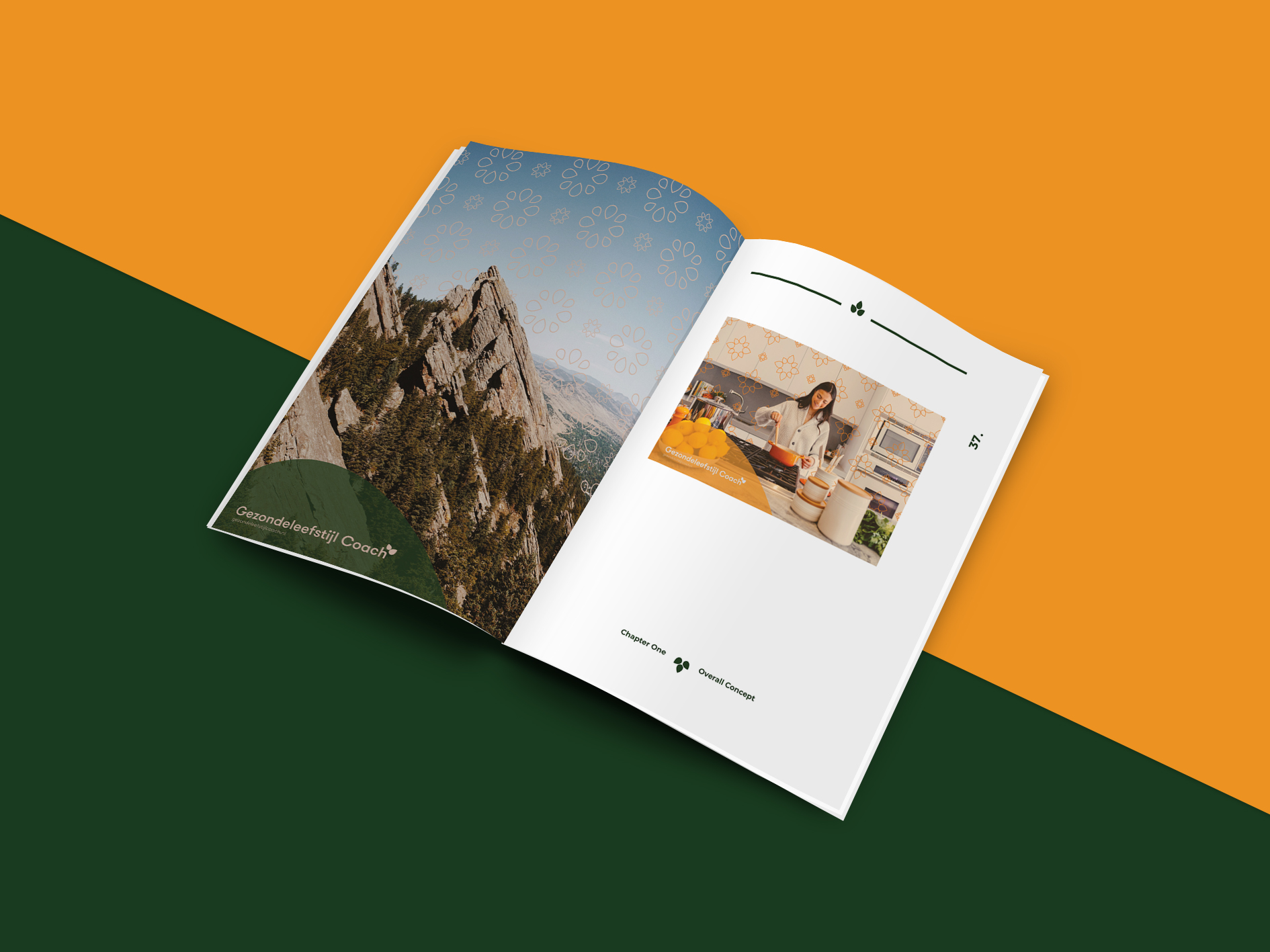
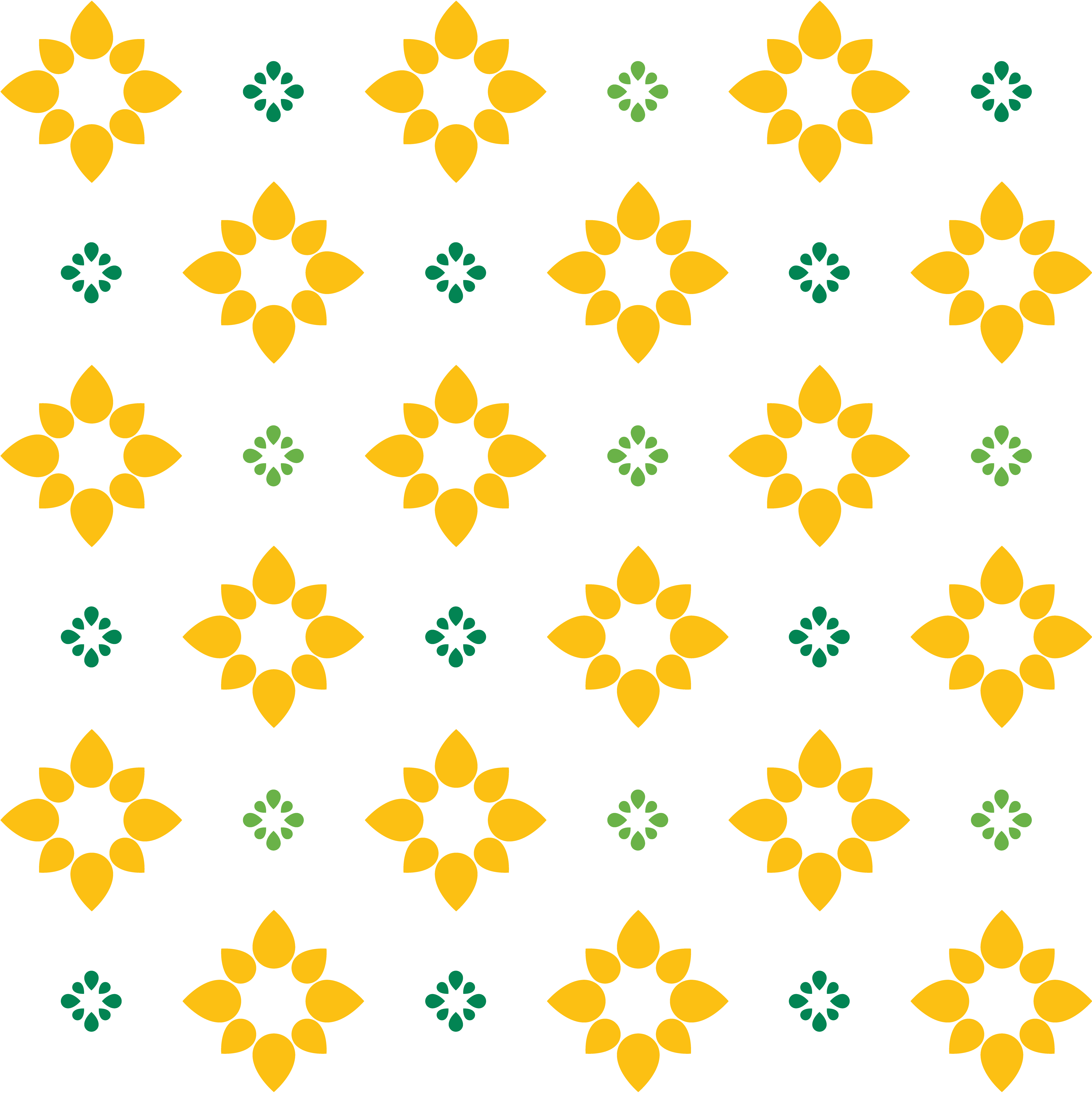
Project: Logo and brandbook for Gezondeleefstijl Coach.
Goal: To make an identity that will be appealing to a christian female audience above the age of 35. Identity should remind of nature and be easily usable by other designers and web-developers working on website builders.
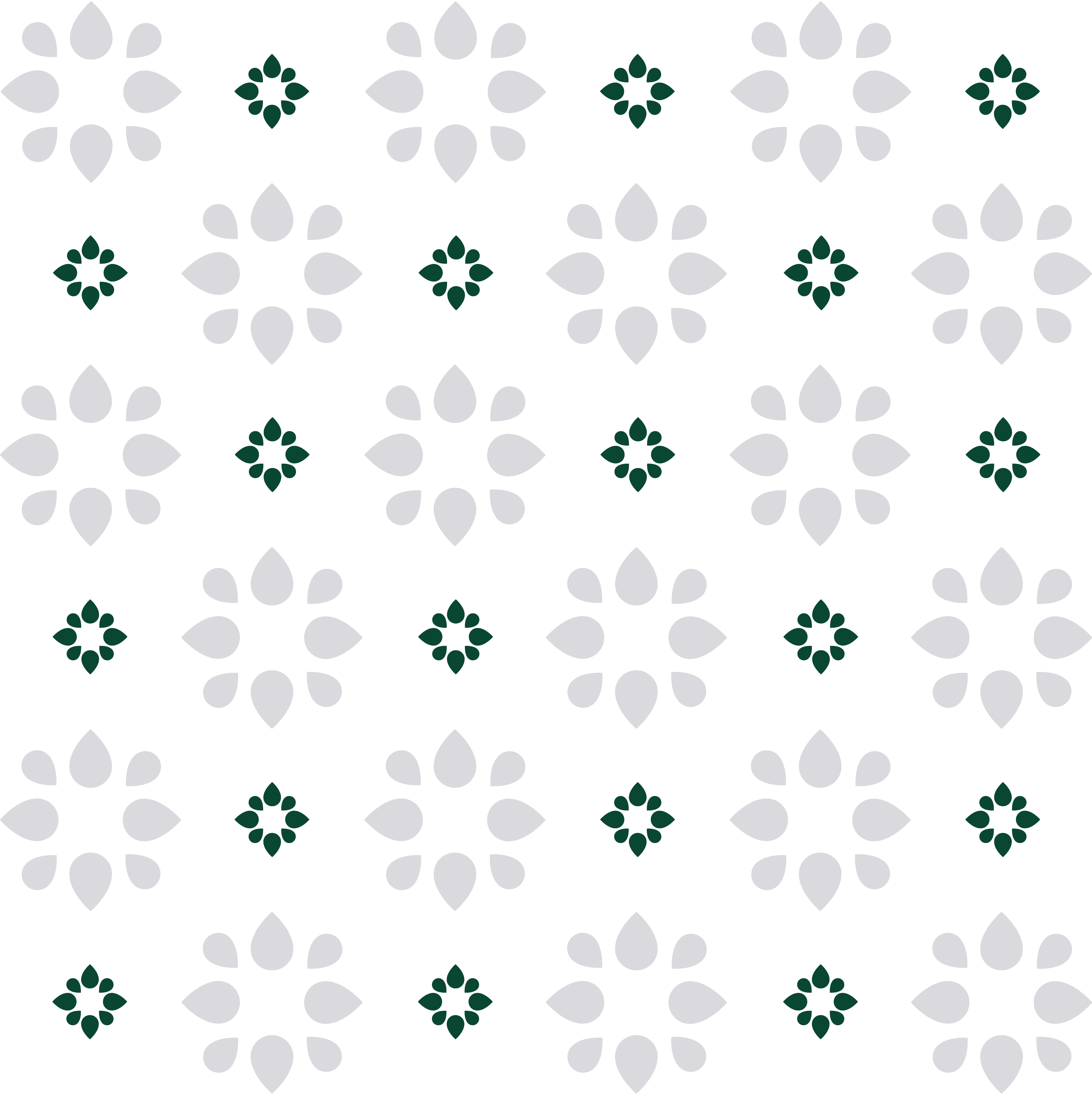
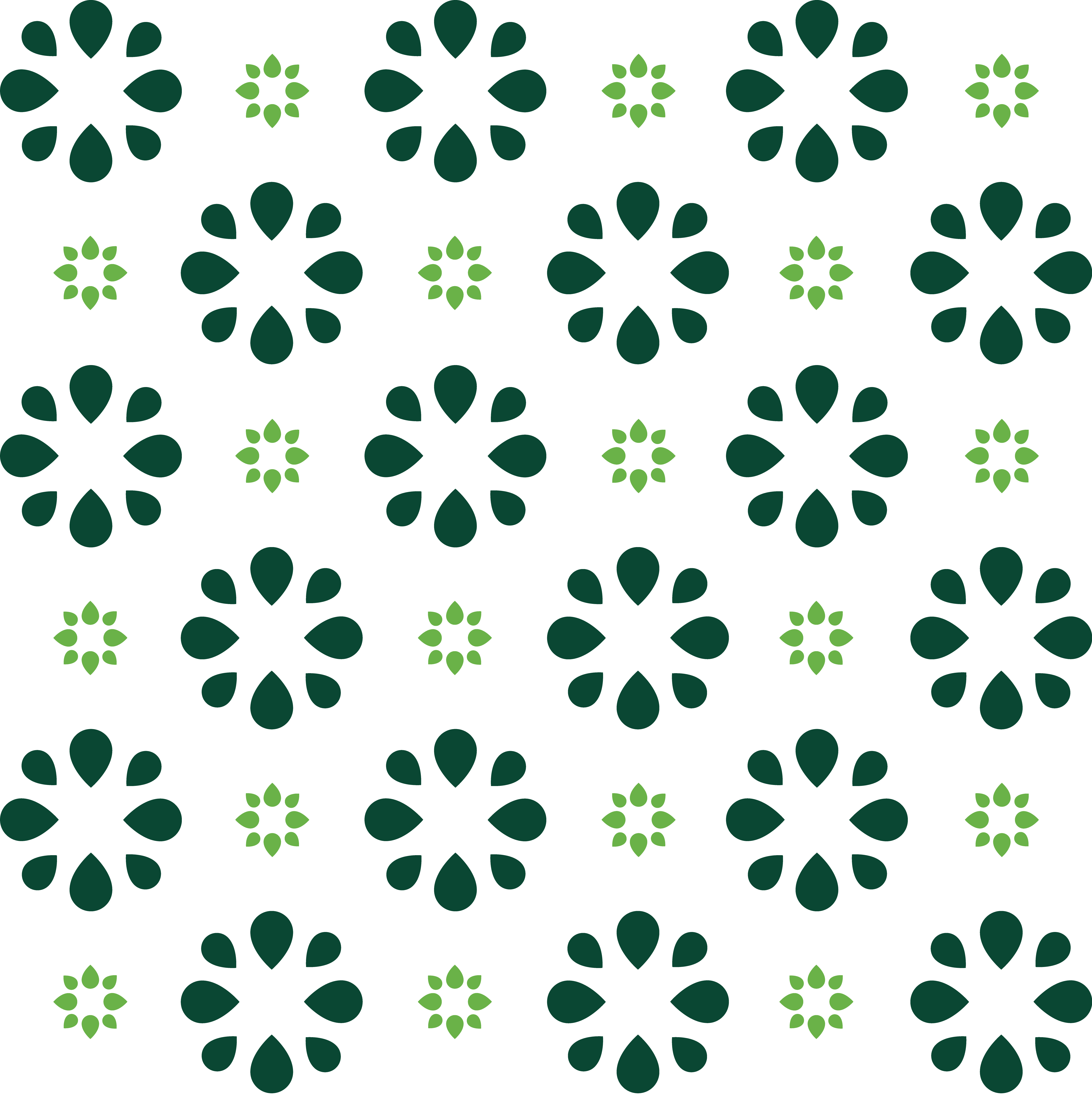
Solution: An identity build around a set of simple elements that can be matched together in numerous ways to achieve any potential future results. Simple floral patterns in combination with bright colours are remisent of traditional home utensils. The brandbook includes instructions on how to apply the identity to any media.
September 2019.




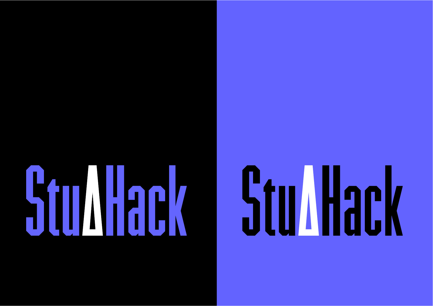
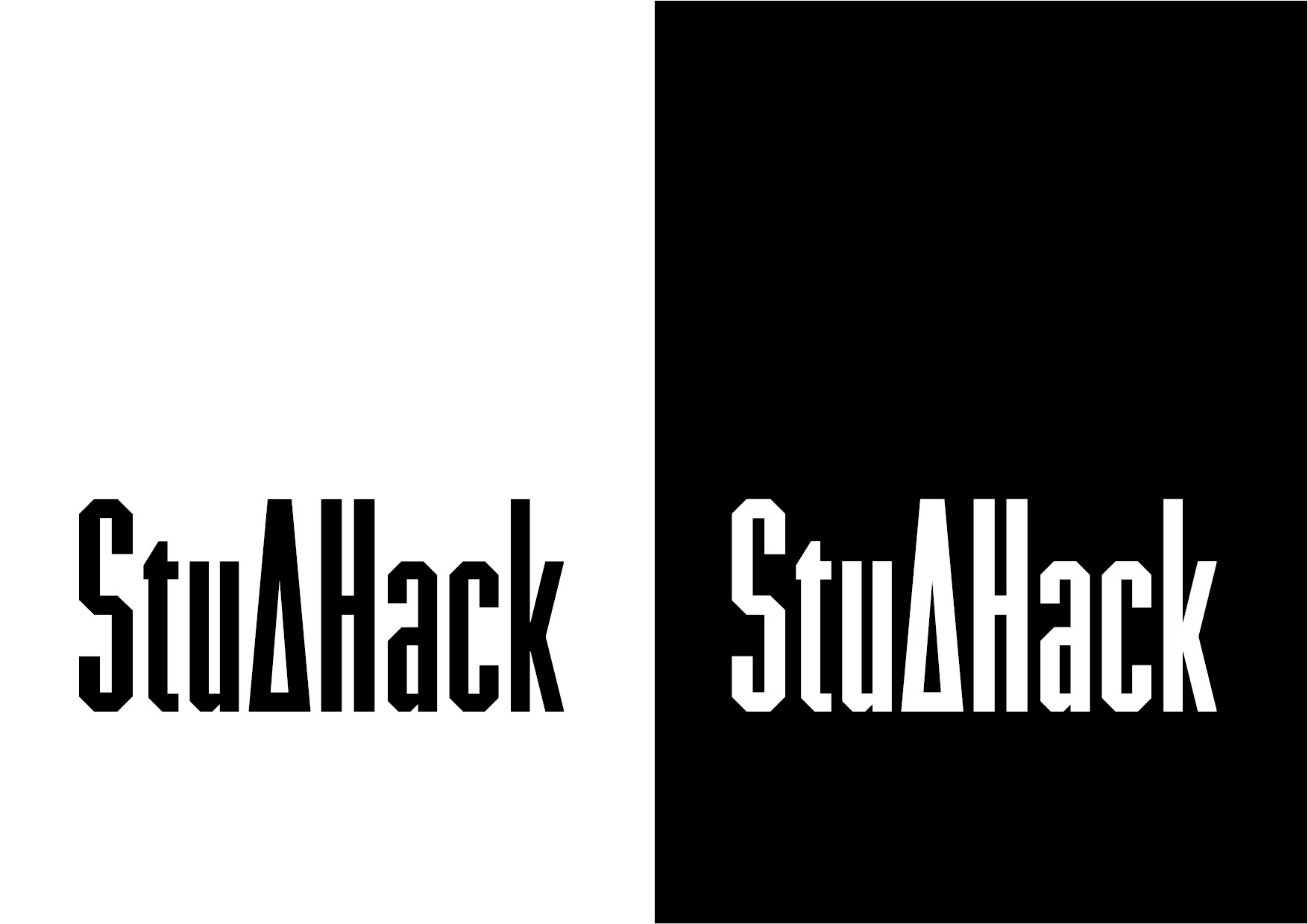
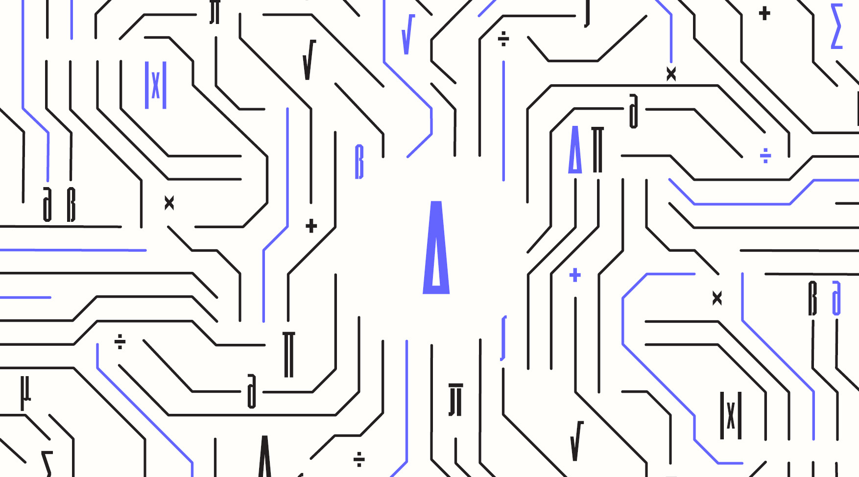
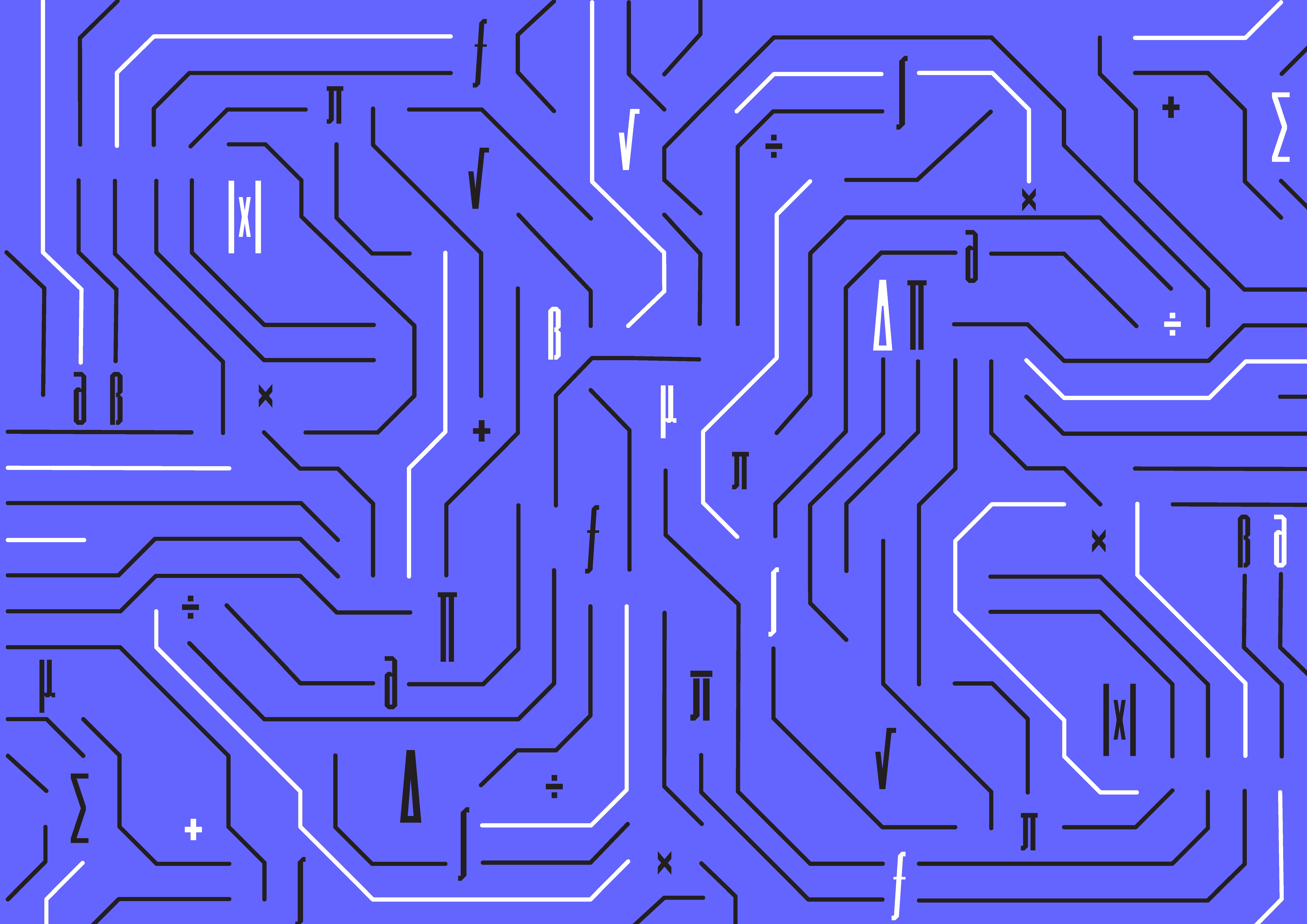
Project:
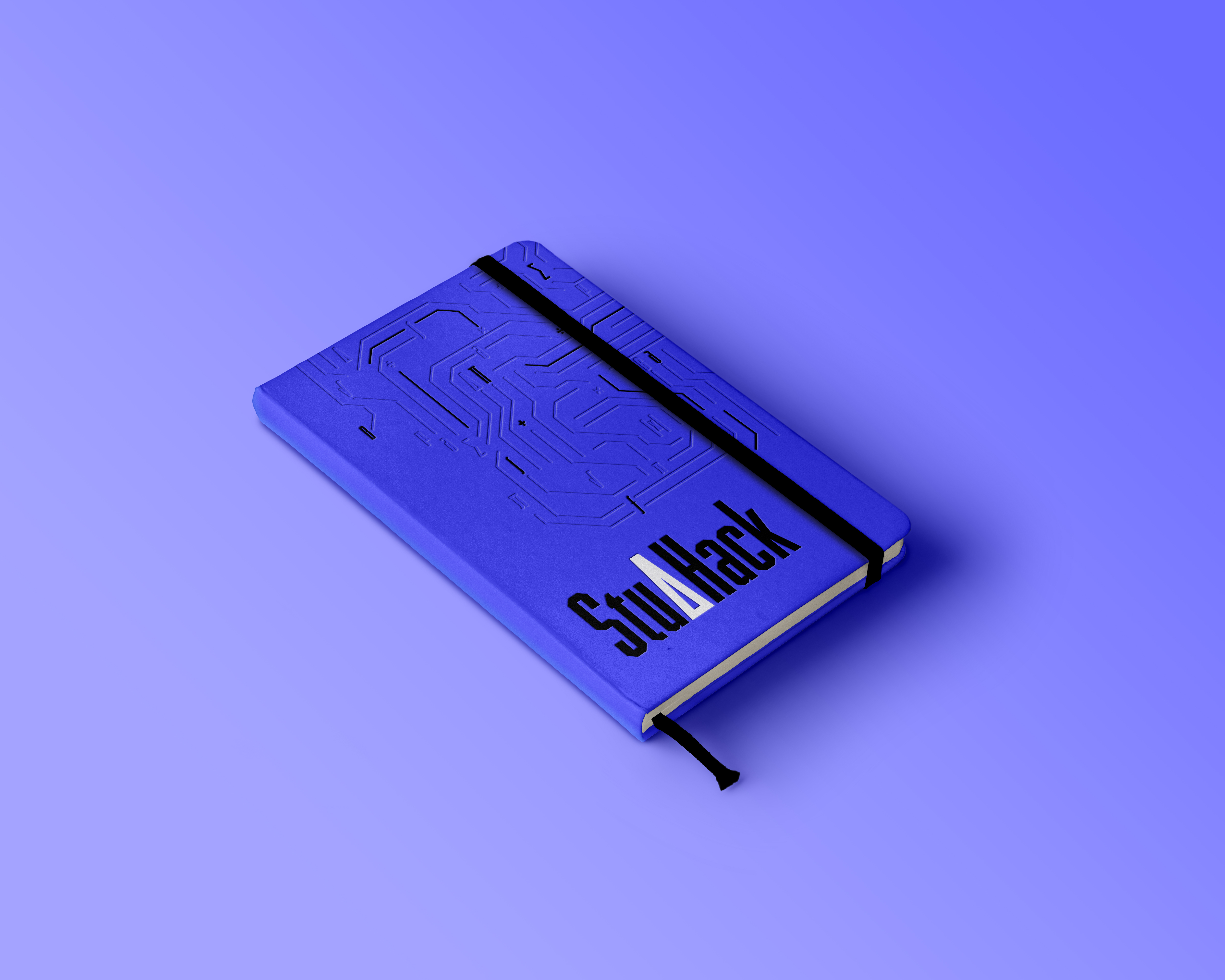
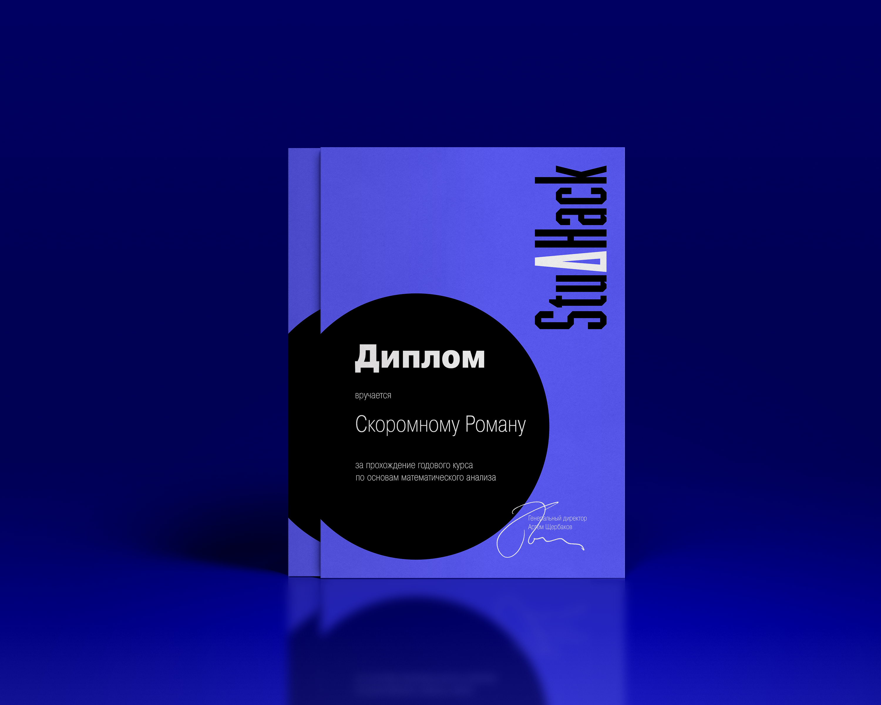
Logo and pattern for a teaching association aimed at helping university students with programming and math-based disciplines.
Goal: A logo evoking a feeling of authority without fear or boredom in bachelor level students. The identity should visually relate to computer science.
Solution: Angular mathematical symbols are used as tokens and circuit boards — as a pattern inspiration. High contrast cold colour palette reminds of digital presence, where most of the studies take place.
November 2018.
